Egocinética offers business consulting services to small and medium-sized companies to help them evolve their businesses and adapt to new paradigms of entrepreneurship. In collaboration with designer Gabrielle Stoiani, the visual identity was developed to maintain the characteristic sobriety of the field while remaining modern, minimalist, and, even though built on geometric shapes, conveying movement—one of the main concepts that the consulting firm wishes to communicate.

The greatest weight of the visual identity lies in the symbol, which at first glance may not say much, but consists of the letters “E” and ‘C’ intertwined like a cube arranged in a semi-three-dimensional space, emulating depth and dynamism—translating the concept of “kinetics” in the company's name into visual form. In addition, the distinctive symbol evokes associations with ancient monograms, creating a unique (and not necessarily literal) format to represent the company's initials.
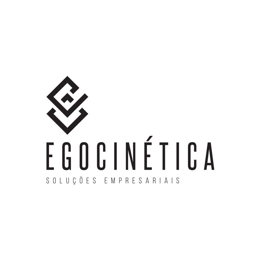
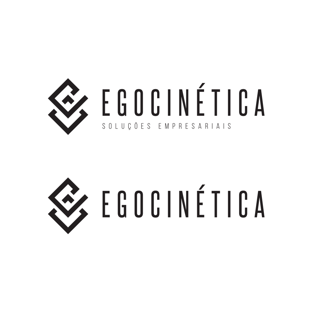
For the lettering, we chose to use condensed fonts, which are ideal for displaying uppercase letters without appearing bulky or overly flashy. This allowed us to achieve our goal of emphasizing the symbol, making the brand's logo elements auxiliary without neglecting them or detracting from the sober and minimalist nature of the identity.
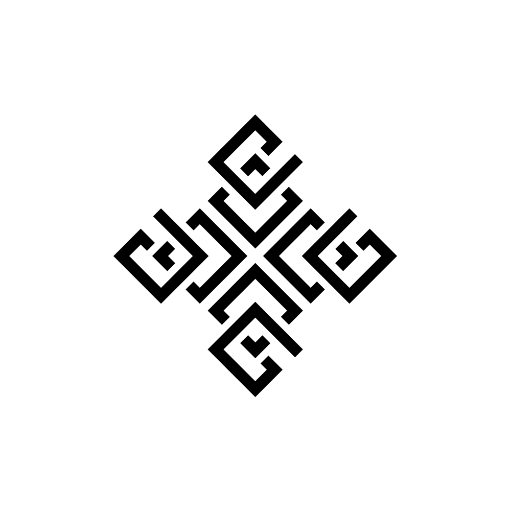
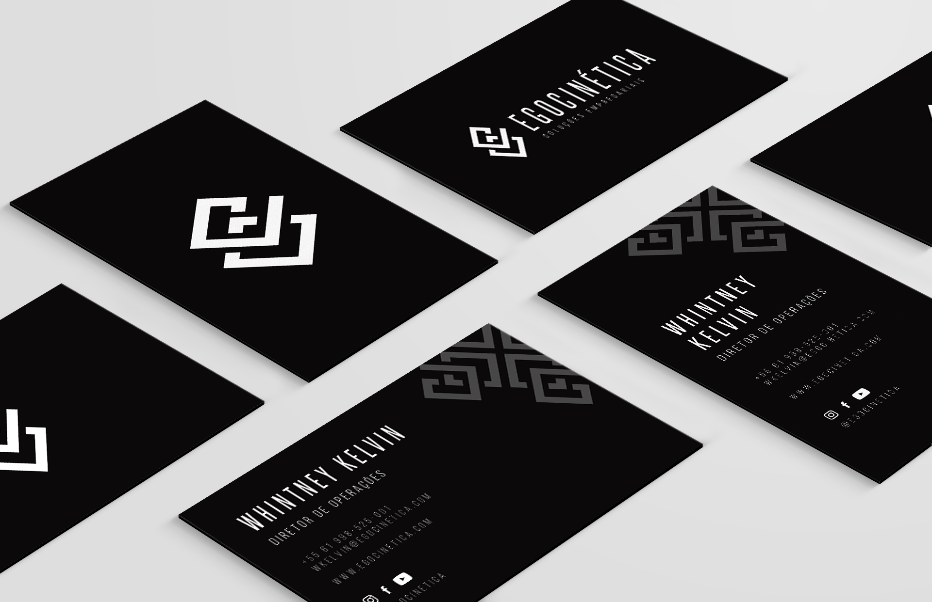
The symbol was also used in the creation of a “mandala” (a geometric configuration of symbols) on the left, applied to business cards and other stationery items, as seen in the example on the right. Thus, the brand concept expands beyond the conventional and further reinforces the idea of movement inherent in Egocinética.